
Mastering UTM Codes for Google Analytics: A Comprehensive Guide
Master UTM codes for Google Analytics with this guide. Learn to create, implement, and analyze UTM tracking for better campaign insights.

Nitin Mahajan
—
April 21, 2026


Want to boost your ecommerce conversion rate? It's not about one big, flashy change. Real growth comes from a methodical process: first, you need to understand your starting point—your baseline metrics. From there, you can start refining the user experience (UX) and streamlining the checkout, using A/B testing to confirm what actually works. It's the small, smart tweaks to navigation, product pages, and the payment process that add up to a serious lift in sales.
Before you can improve anything, you have to know what you're working with. Forget chasing a universal "good" conversion rate. Every store is different, and the only number that truly matters is your own. The goal isn't to hit an arbitrary industry benchmark; it's to consistently beat your own previous performance.
This means you need to look past a single, site-wide conversion number. While that top-line metric is a decent health check, the real opportunities for improvement are buried in the details. You have to segment your data to see what's really going on.
To get started, slice and dice your conversion data from a few different angles. Ask yourself:
Answering these questions will shine a light on your biggest growth opportunities. You might find out your mobile checkout is a disaster, or that a specific marketing channel is burning cash without bringing in sales. These details are also crucial for figuring out if your marketing is working, a topic we cover in our guide on how to calculate marketing ROI.
Context is everything when it comes to conversion rates. You'll see stats floating around that the global average is somewhere between 2% and 4%, but that figure is almost useless without context. The numbers can swing wildly from one industry to the next.
To help you see where you might stand, here’s a look at some typical benchmarks.
This table compares average conversion rates across different ecommerce sectors to help you benchmark your performance.
Source: Data compiled from various 2023 industry reports.
Seeing these numbers illustrates just how much performance can vary. Someone selling home goods has a completely different set of challenges than a brand selling beauty products.
Ultimately, the most important benchmark is your own history. Your real goal should be to beat last month's numbers, or what you did this time last year. That’s how you build sustainable, long-term growth.
By grounding your efforts in your own data, you're set up for success. To dive even deeper, check out these comprehensive Ecommerce Conversion Rate Optimisation strategies that can provide a systematic framework for improving your site's performance.
If your website is frustrating to use, you're bleeding sales. It’s as simple as that. The absolute foundation of a high-converting ecommerce store is a smooth, intuitive user experience (UX) that guides shoppers from the moment they land on your site to the final click of the "buy" button.
Think of it like a physical store. If the aisles are cluttered and the signs are confusing, people will walk out. Your website's navigation is no different. If a customer can't find what they want in a few clicks, they're gone—probably to your competitor.
Since shoppers can't physically touch your products, your visuals have to do all the heavy lifting. This is non-negotiable. You need high-resolution photos from multiple angles, a zoom feature that shows off the details, and maybe even a video of the product in action.
Your descriptions need to be just as compelling. Don't just list specs; explain the benefits. Write copy that anticipates and answers customer questions. This kind of transparency builds the trust a shopper needs to feel confident adding an item to their cart.

In ecommerce, every second counts. Literally. A slow-loading website is a top reason for cart abandonment. Even a one-second delay can tank your conversion rate, so ensuring your site is lightning-fast—especially on mobile—is absolutely critical.
Beyond speed, a truly great UX is one that works for everyone. Making sure your site is easy to use for people with disabilities isn't just the right thing to do; it broadens your audience. Diving into the principles of web accessibility for e-commerce websites can give you a real competitive edge.
Building trust is the final piece of the puzzle. Before they buy, people look for proof that they're making a good decision. This is where customer reviews, testimonials, and star ratings come in. Displaying this social proof prominently on your product pages provides that authentic validation that can tip the scales.
Let's be real: your customers live on their phones. But just because they're browsing your site on mobile doesn't mean they're buying. This is the classic mobile conversion gap. To fix it, you must adopt a true mobile-first mindset instead of treating your mobile site as a shrunken-down version of your desktop site.
Mobile devices are responsible for a massive 73% of ecommerce visits, yet desktops still convert better, with a 4.8% conversion rate compared to mobile's 2.9%. If you want to dive deeper, you can find more device-specific ecommerce benchmarks that paint the full picture.
A genuine mobile-first approach means you’re designing the entire experience for someone holding a phone, probably with one hand. This changes everything. We're talking about button placement, form fields, and navigation. Every tap needs to feel intuitive, and every important element has to be within easy reach of a thumb.
This infographic nails the concept of a simple, thumb-friendly mobile checkout.

Notice the large, easy-to-tap buttons and the minimum number of fields to fill out? That’s what creates a smooth path to purchase instead of a frustrating dead end.
A responsive design isn't the finish line; it's the starting block. To actually win over mobile shoppers, you have to simplify relentlessly. Cut clicks, declutter pages, and make the checkout process so fast it's practically invisible.
Think about the user's context. They're on the go, they're distracted, and they have zero patience for a slow page. Your mobile site has to be laser-focused on speed and simplicity. That’s how you turn casual mobile browsers into confident buyers.
The checkout page is where the magic happens—it’s the final hurdle before a browser becomes a buyer. It’s also where most sales fall apart. The smallest friction at this stage can make someone abandon their cart and never look back.
Every field they have to fill out, every extra click, and every unexpected cost chips away at their resolve. With the average cart abandonment rate hovering around 70%, it's clear that most checkouts are far from perfect. The top culprits? Surprise shipping costs and forcing people to create an account. They are absolute conversion killers.
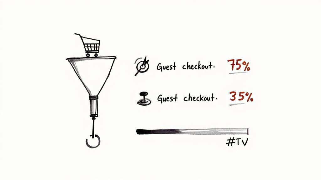
Your one and only goal here is to make giving you money as easy as humanly possible. Our top piece of advice is to offer a guest checkout option. Forcing a new customer to create an account before they’ve even decided to trust you is asking way too much.
Adding a simple progress bar can also be surprisingly effective. It visually guides shoppers, showing them where they are in the process—like "Step 2 of 3." This small detail manages expectations and makes the process feel less like a chore.
The checkout is not the time for surprises. Transparency builds trust, and trust is the currency of ecommerce. Be completely upfront about all costs—including taxes and shipping—before you ask for their credit card details.
Finally, let's talk about payment flexibility. In a world of one-click ordering, making someone manually type in their card details feels ancient.
To help you spot these issues in your own checkout, here’s a quick breakdown of common friction points and how to fix them.
Tackling these common issues head-on is crucial. By removing these friction points, you create a smooth, trustworthy path to purchase that turns more abandoned carts into confirmed sales.
Guesswork has no place in a serious e-commerce strategy. To make changes that genuinely move the needle on conversions, you need data. This is where A/B testing, or split testing, becomes your secret weapon. The idea is to show two versions of a webpage to different audience segments and see which one convinces more people to take action.
It starts with a solid hypothesis. You don’t just change things randomly. You might hypothesize, for instance, that making your "Add to Cart" button a vibrant orange instead of a muted blue will grab more eyeballs and, therefore, more clicks.
To run a clean test, you'll split your website traffic. 50% of visitors see the original page (the 'control'), and the other 50% see your new design (the 'variation'). From there, you track which version leads to more of your desired action—whether that's a click or a completed purchase.
Plenty of tools can handle the technical side. Platforms like Shopify have some native capabilities, but dedicated software like Google Optimize (though it's sunsetting, its principles live on) or VWO offer more power. The most critical part? Let the test run long enough to achieve statistical significance to ensure the results aren't a fluke.
The real magic happens when you test one small thing at a time. A headline. An image. The text on a button. These small, validated wins add up over time, compounding into massive, sustainable growth for your business.
Embracing this data-first thinking is what separates successful stores from the ones that stagnate. If you're curious how this approach can influence your marketing, see our breakdown of what a data-driven marketing agency brings to the table. Let's tackle a few common questions.
You’ll hear 2-4% thrown around as a general benchmark, but that number can be misleading. A "good" conversion rate is completely relative. A store selling $5,000 custom furniture will have a wildly different rate than one selling $15 phone cases. The industry, price point, and brand reputation all play a huge role.
Instead of chasing an arbitrary industry average, focus on your own numbers. Your real goal should be consistent, month-over-month improvement. Outperforming your past self is the only benchmark that truly matters.
There's no single silver bullet, but if pressed, I’ll always point to the checkout process. Two changes consistently deliver the biggest wins.
Close behind is your product page. Investing in professional, high-quality photos and writing compelling, benefit-focused descriptions is one of the fastest ways to build trust and convince shoppers to click "Add to Cart."
This really comes down to your traffic. You need to let a test run long enough to reach statistical significance. That’s a fancy way of saying you need enough data to be confident the results aren't just a random fluke. For most online stores, a good rule of thumb is to run the test for at least two full business cycles—that usually means two weeks. This helps iron out any weird spikes or dips.
Ready to stop guessing and start growing? BrandBooster.ai uses data-driven strategies to find what works for your store, ensuring your marketing spend delivers real results. Discover how we can boost your conversions.